
The Power of Data Visualization in SaaS: Best Practices and Top Tools for 2025
Data visualization is a cornerstone of modern SaaS products, enabling users to derive insights from complex datasets quickly and effectively. In an era where data-driven decisions are paramount, the ability to present information clearly and engagingly can make or break a product’s success. For SaaS companies, embedding powerful data visualization tools into their platforms isn’t just about aesthetics—it’s about creating a seamless, user-centric experience that drives adoption, engagement, and retention.
In this article, we explore five key best practices for effective data visualization in SaaS and highlight the top tools available in 2025, including Qrvey, Luzmo, Sisense, ThoughtSpot, Metabase, GoodData, and Power BI Embedded. These tools are designed to meet the unique needs of SaaS platforms, offering features like embedded analytics, white-labeling, and multi-tenant security.
1. Choose the Right Data Visualization Type
Selecting the appropriate chart type is crucial for conveying your message effectively. Different data types require different visual representations. For instance:
- Categorical data is best represented with pie charts or bar graphs to show proportions and comparisons.
- Numerical data often benefits from line graphs or histograms to display trends and distributions.
- Relationship data can be visualized using scatter plots or heatmaps to identify correlations.
Using the right type of visualization ensures that your audience can quickly grasp the key insights without confusion. For example, if you’re showing sales performance across regions, a bar chart might be more effective than a pie chart, as it allows for easier comparison between categories.
2. Eliminate Clutter and Draw Attention to Relevant Data

A cluttered visualization can overwhelm users and obscure the main message. To keep your dashboard clean and focused:
- Remove unnecessary elements such as excessive gridlines or redundant labels.
- Use whitespace strategically to create balance and guide the viewer’s eye.
- Highlight key data points with color, size, or positioning to draw attention to important insights.
For example, if you’re presenting a line graph showing monthly revenue growth, you could use a bold color for the peak month to emphasize its significance.
3. Make Effective Design Choices
Design plays a critical role in the effectiveness of data visualization. Consider the following:
- Color: Use a consistent and accessible color palette to differentiate between data categories.
- Font Size and Style: Ensure readability by choosing legible fonts and appropriate sizes, especially for smaller screens.
- Layout: Arrange elements logically to guide the viewer through the data in a natural flow.
A well-designed visualization not only looks professional but also enhances user understanding and engagement. For instance, placing the most important KPIs at the top of a dashboard can help users quickly access the information they need.
4. Label Chart Modules Appropriately

Clear labeling is essential for ensuring that your audience understands the data being presented. Each chart should have:
- Axis Labels: Clearly indicate what each axis represents.
- Titles: Provide a concise summary of the chart’s purpose.
- Tooltips and Captions: Offer additional context or explanations for complex data points.
For example, a line chart showing quarterly sales should have a title like “Quarterly Sales Performance” and axis labels indicating the time periods and sales figures.
5. Choose Appropriate Data Scaling
The scaling of your data can significantly impact how it’s interpreted. Consider the range and distribution of your data when selecting a scale:
- Linear Scale: Suitable for data with a consistent range.
- Logarithmic Scale: Useful for data with a wide range of values to prevent distortion.
For instance, if you’re displaying sales data that spans several orders of magnitude, a logarithmic scale may provide a clearer representation of trends.
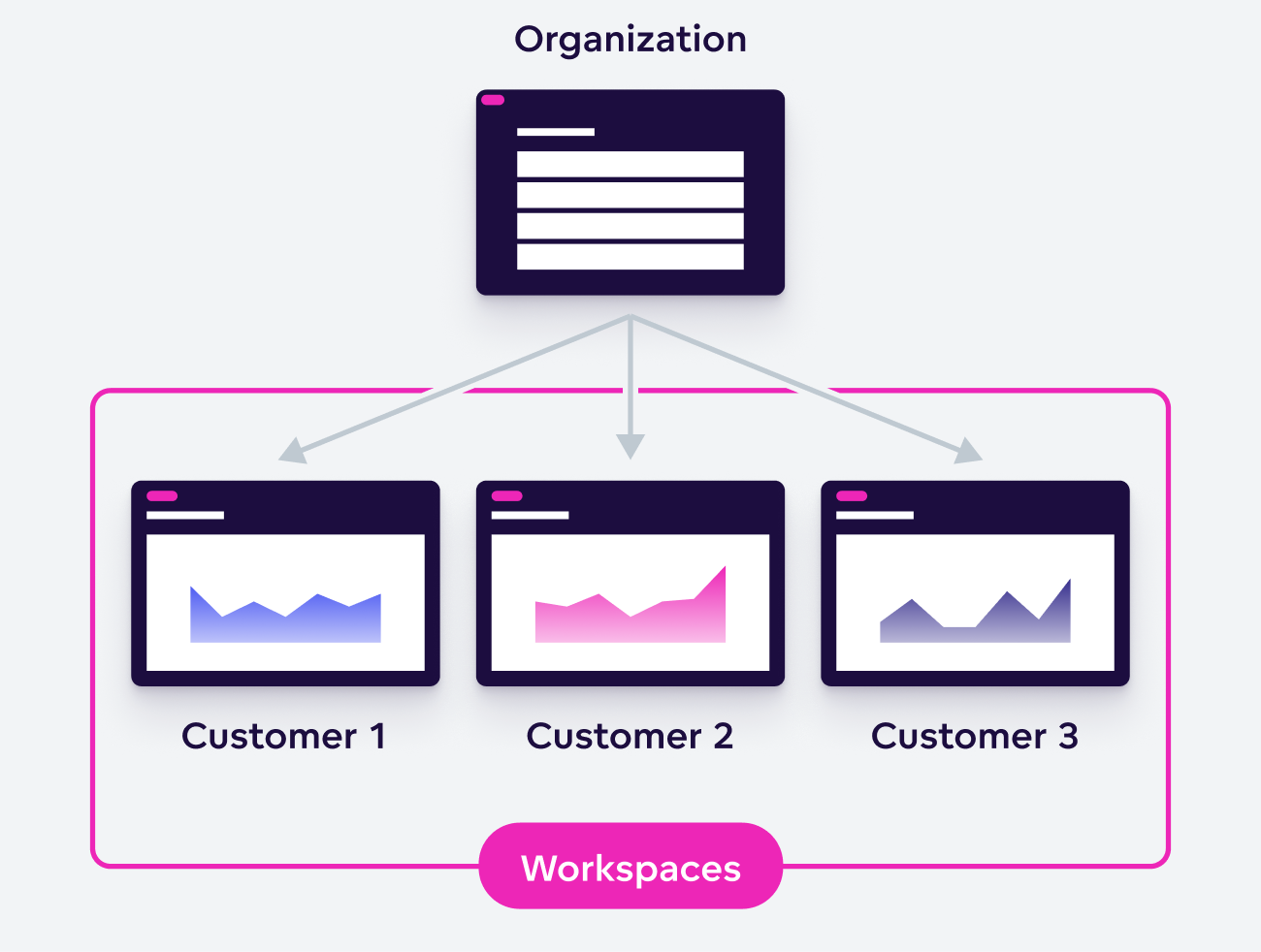
Bonus: White Labeling Matters for Embedded Analytics

For SaaS platforms, white labeling is crucial. It ensures that the analytics experience aligns with your brand and provides a seamless user experience. Tools like Qrvey allow for easy integration of data visualization widgets into your cloud environment, with security assertions based on JWT tokens for multi-tenant data protection.
Top Data Visualization Tools for SaaS in 2025
1. Luzmo
Luzmo is ideal for SaaS teams looking to embed interactive visualizations directly into their products. Its drag-and-drop interface and AI-powered insights make it a favorite among product leaders. Luzmo supports full white-labeling, allowing for brand consistency across all dashboards.
2. Sisense

Sisense offers deep customizability for dev-heavy SaaS teams. With full API access and a React SDK, it allows for highly tailored visualizations. However, it requires significant engineering resources for setup and maintenance.
3. ThoughtSpot
ThoughtSpot focuses on self-serve data exploration, allowing users to search for insights using natural language. While intuitive for non-technical users, it lacks advanced embedding capabilities for SaaS workflows.
4. Metabase
Metabase is a fast and open-source option for startups and early-stage SaaS products. It’s easy to use and embed, but it lacks robust multi-tenancy and branding options for larger-scale deployments.
5. GoodData
GoodData is a headless BI solution that offers strong SaaS credentials, making it suitable for B2B environments requiring compliance and security. However, it requires significant front-end development for branding and UX.
6. Power BI Embedded
Microsoft’s Power BI Embedded is a familiar choice for enterprise SaaS products integrated with Azure and Office 365. While robust and secure, it often feels disconnected from the SaaS experience, limiting its effectiveness for agile product teams.
How to Pick the Best Tool for Your SaaS Product
When selecting a data visualization tool, consider the following factors:
- Integration: Does the tool fit seamlessly into your product workflow?
- Customization: Can you brand and personalize the experience for your users?
- Scalability: Will the tool support your growing user base and data needs?
- User Experience: Is the tool intuitive for both technical and non-technical users?
By focusing on these aspects, you can ensure that your data visualization strategy aligns with your product goals and user expectations.
Conclusion
In the competitive world of SaaS, data visualization is no longer just a feature—it’s a core component of the user experience. By following best practices and leveraging the right tools, SaaS companies can transform raw data into actionable insights, driving engagement, retention, and growth.
Whether you choose Qrvey for its embedded analytics or Luzmo for its product-led approach, the key is to prioritize clarity, usability, and brand consistency. As the demand for interactive and personalized data experiences continues to rise, investing in robust data visualization will be essential for staying ahead in 2025 and beyond.


